
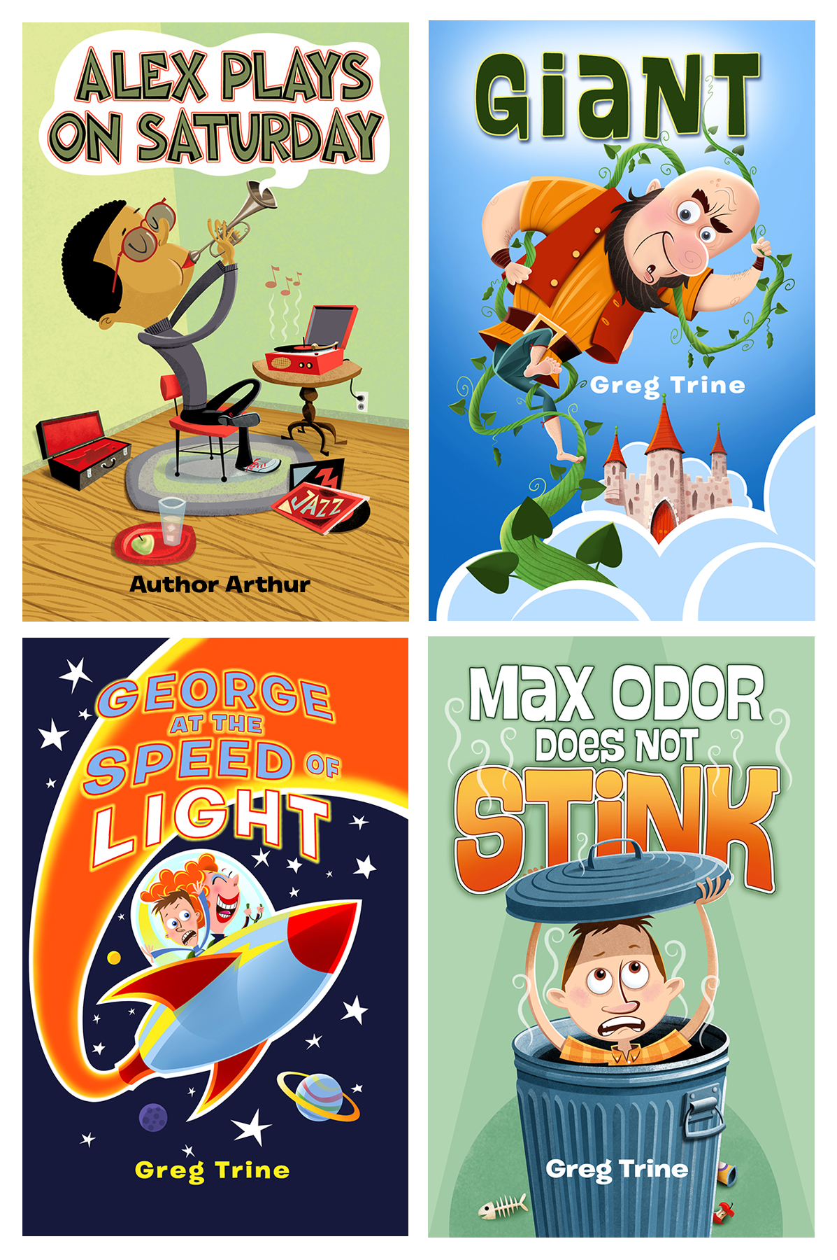
I enjoy all my work, but I’m particularly excited when called upon to illustrate a Young Readers cover. Also known as Middle-Grade Fiction, the books assigned to me are humorous tales with a wry twist. I’ve done a number of them for acclaimed author Greg Trine, who always cracks me up when I pore through his pages for cover and interior spot ideas. Greg gives me considerable creative freedom, and his great writing makes my task very pleasant.
The process I use for this age level is straight-forward. I place the protagonist on the cover, center stage, wanting to capture immediate attention with a simple composition. It is my idea that these covers, for this age group, should not require deep thinking. Minimal mental exercise is required to guess what Alex will play on Saturday, why George is terrified inside this spacecraft piloted by a whacky woman, or or how it is that a kid surnamed Odor does not actually stink.
For full disclosure, The Alex Plays on Saturday is unpublished. I made him up for self-promotion. I was in the mood to play with a complimentary, palette, arranging the elements in an oval composition. The Greg Trine books are real and well worth reading.
My process goes like this: I peruse the book to get a feel for the main character. I want to understand what it is that got them into their predicament. Does Max really stink? Is George’s grandma a real jet jockey, or a bit off her biscuit? Is Giant your average Fi-Fi-Fo-Fum baddie? I won’t say anything more about them; read the books and find out.
I never want the illustrations to give away the book. A cover should only draw you in. It should never tell the whole story, or there would be no reason to read the whole story. Likewise for the interior spots. I usually do about a half dozen interior grayscales for these books. Same rules apply; don’t give away the whole chapter, illustrate something right before, or right after, a climactic moment.
Getting a good feel for the character, I quickly scribble a number of thumbnails. These are very fast, very loose pencils intending to guide me on composition. From those thumbnails I choose about three to develop into a better rough. Still very loose, but taking shape, so as to help make a choice on the winning candidate.
Once the winner is chosen, I take that rough to a finished pencil sketch and send it to the client. The client is an art director, senior designer, or the author themselves. After we agree upon changes, I get down to business. The pencil gets scanned into Photoshop and placed on the top layer, which I multiply (making it transparent to successive layers). All other layers are under it. The pencil sketch is never retained as any part of the final art. In other words, I do not colorize the pencil sketch. It always gets trashed. I redraw everything on my Wacom tablet, and paint digitally, using quite a few layers in the process.
Once the piece is finished, I find whether the file should stay in RGB (Red, Green Blue) or be converted to CMYK (Cyan, Magenta, Yellow, Black). I usually work at 300 dpi, which is quite sufficient for the size books I illustrate. I offer the client the file in whatever format they, or their print service, desire.
It’s always a pleasure to see how they came out, and even more so when the client is thrilled. Can’t wait for the next book cover assignment.
All illustrations ©2020 Ed Koehler